Bowling Green HotRods Presents 2022 Logos And Uniforms
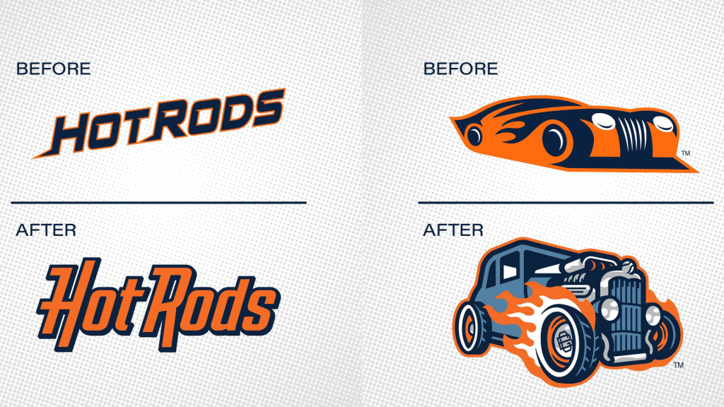
The High A Affiliate of the Tamp Bay Rays, the Bowling Green HotRods, presented its new logos and uniforms for the 2022 season today. The new look is quite a bit different than the previous one.

As you can see, the logos are very different. The old ones were more stylized. The new ones are more detailed. An improvement? I am in limbo here. The new scripted logo is an improvement for sure but I liked the old car logo better.
If some new logos were not enough, the club comes with several new uniforms as well. In total, the club will sport six (!) uniforms for the 2022 season.

Not all uniforms are really new. The Alternate no. two uni and no. three uni sport some logos that were in use before the rebranding. It is clear that the first four uniforms (from left to right) are brand new as the website of the club states the following about three of those uniforms only:
Home
A clean-looking white pants/jersey combo with two-toned stripes on each sleeve in orange and blue, as well as the trim around the neck. The new Hot Rods wordmark stretches across the chest in the team’s navy blue while numbers on the lower left abdomen are orange with blue piping. The classic primary “BG” logo with the circle around the outside is displayed on the left sleeve. The look is topped off with a new on-field hat: an orange lid with the interlocking “BG” logo outlined in navy blue.
Rays Day
The team will take on a new look every Sunday home game by paying homage to their parent club. A new baby blue jersey with the “Hot Rods” wordmark across the chest will be worn by the Hot Rods with white pants. The wordmark is orange with a navy outline as are the numbers on the lower-left abdomen, while the sleeves have an orange, white, and blue three-stripe trim, same for the collar. The primary “BG” logo with the circle around the outside is displayed on the left sleeve. This uniform also gets a special hat: a baby blue rear three-panels while the front of the hat dons the new car logo on two white panels, framed by a navy-blue visor.
Alternate Orange
The last uniform to receive an overhaul is the orange alternate. The orange button-down jersey includes a large blue accent with white piping that begins at the collar, works toward the underarms over the upper chest, and cascades down each side of the jersey. The new Hot Rods wordmark across the chest and the numbers in the lower-left front are navy with white and navy outlines. The primary “BG” logo with the circle around the outside is displayed on the left sleeve while each sleeve is accented with blue and white striping. This uniform also gets the new on-field hat: orange with the interlocking “BG” logo outlined in navy blue.
But the caps of the first two uniforms still have the old Bowling Green logo on the front.
The logos the club presented are the third set of logos the team introduced dating back to the original black, yellow, and red look during the team’s inaugural season of 2009 after the club moved from Columbus, Georgia, where they were named the Columbus Catfish. In 2015, the club overhauled the Hot Rods brand while bringing in the orange and blue that’s still being used to this day.
