Intimidators become Cannon Ballers
It was announced earlier this year the Kannapolis Intimidators were in the process of rebranding as they will go to a new stadium in 2020. During an unveiling event Wednesday night at Kannapolis’ historic Gem Theater, the Cannon Ballers moniker was shot out into the world.
Prior to the 2001 season, the club adopted the name Intimidators when Dale “The Intimidator” Earnhardt bought a share in the club. But as the club announced the current name change, there was a lot of criticism, not only from the baseball fans but also from the racing world. In a letter the club explained its move: “We do not own and therefore cannot confidently build around the Intimidator name.”
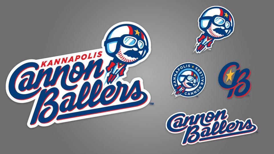
“Cannon Ballers” represents both the history of Kannapolis and the carnival-like atmosphere the team plans to provide at its new ballpark, while the logo set offers subtle nods to Earnhardt and his outsized legacy.
First of all, the new name and logo refer to the industrial heritage of Kannapolis as it is linked with James William Cannon and the textile factory he founded, the Cannon Mills Company. (The city’s name is a derivation of earlier, unofficial variants such as “Cannon-opolis.”) The Cannon Mills Company was founded in 1888 and ceased operations in 2003. At its height, it was the world’s largest textile company. In the name the team contest, the name Cannons was the nr. 1 option. But the brass of the club could not do much with it and therefore moved it a bit further.
https://twitter.com/Kcannonballers/status/1187151056507166720
For the change, the logo was not designed by San Diego based Brandiose. This time, Studio Simon had the honor to do so. The Louisville based designing company stated it was a challenge to reconcile Kannapolis’ past with the present, while also being cognizant of the esteem in which many fans held the Intimidators name. The sprawling North Carolina Research Campus, a public-private partnership, is located where the mill once stood. The new ballpark, referred to by city planners as an SEV (sports and entertainment venue), is an anchor of a much larger downtown revitalization project. In short, Kannapolis is in the midst of a total reinvention.
Dan Simon stated: “When I went to Kannapolis, I met with civic leaders, business leaders, season ticket holders, families, people who grew up there and transplants. All kinds of people,” said Simon. “I was hoping to come back having determined what the consensus is. Are people looking to move on from the mills, or is this mill history so important that we can’t not have the identity reflect that? But instead of coming back with a consensus, I found that it was split down the middle. … So I’m sitting there thinking, we’ve got to go one direction or another. Otherwise half the people are going to think that their voices weren’t heard. You’re not always going to hit on something that accommodates both. It was a tough nut to crack.”
The name Cannon Ballers refers to entertainment. And what is more about entertainment than minor league baseball? So the name was actually a good fit.
And then the uniforms. Normally with a name change, it takes a while before the new uniforms are presented. Not this time.
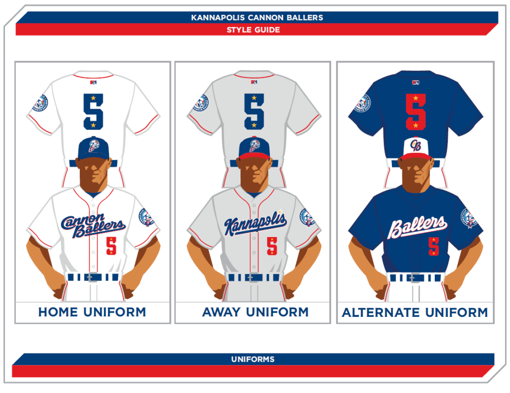
The three uniforms the club will sport have some classic piping that runs up along the buttonholes around the neck and down again. The cap logo will be the human cannonball that is part of the main logo. All jerseys will sport some playful uniform numbers that have stars in it. The stars refer to the Evil Knievel-like jumpsuit the cannonball logo is wearing. The home uniform is in classic white and sports an all blue cap as the road uni is in classic grey with a blue cap with a red lid. The alternate uniform will feature a blue jersey with white pants and a blue cap with white front and red lid, sporting the letters CB that feature a yellow star in it.

As a cap nut, I like the new road cap a lot. The logo may be rather big but that is normal nowadays. If you want one, hurry. The caps are really hot as the home cap is already sold out in the sizes 6 7/8, 7, 7 1/8 and 8.