The Development of The Minor League Logo
Since 1901, Minor League Baseball is a constant in US baseball. It all started as a collective group of independent leagues but in the 1930s more MiLB clubs became an affiliate of Major league clubs. Since 1999, MiLB sports its own logo. In the following twent-six years, the logo underwent some changes.
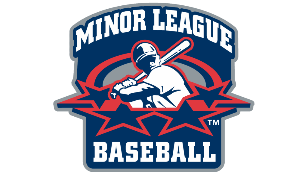
As written above, Minor League Baseball presented its own logo in 1999. It was a tall square shaped logo with a “dome” on top. The dome sported the words Minor League, and the bottom of the square sported the word baseball. The batter shown in the center of the logo, was surrounded by four stars.
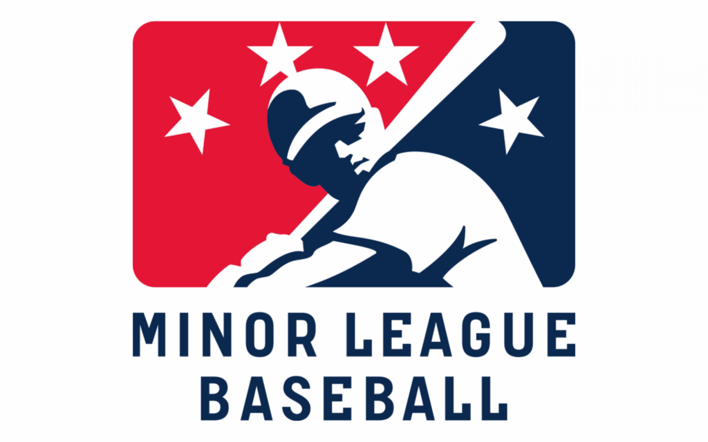
This logo lasted through 2007, as it was replaced with the following logo in 2008.That was also the year when the MiLB logo appeared on the back of Minor League caps, sixteen years after MLB came up with its logo on the back of their caps. The 2008 logo uses the same image of a player, except this time it was largely white and placed in the middle of a wide rectangle. The picture divided the shape in two halves: dark blue on the right, red on the left. Except for that, there were also four white stars above. Unlike before, these weren’t tilted backwards. Beneath the logo, they’ve written the words ‘Minor League Baseball’ in slimmer, blue letters. This logo lasted through 2021.

In 2020, during Covid, MLB committed a coup in MiLB and grabbed power in order to cut 42 teams in a cost cutting move of the greedy MLB owners. If that wasn’t enough, the forced a new logo down the throat of MiLB owners.
The new logo had the same dimensions as the MLB logo, but it still was kind of similar than the previous logo. On the one hand, the logo of Minor League Baseball (MiLB) depicted the same objects as that of MLB. And yet, it gives them from a somewhat different perspective. The biggest difference between the previous logo and the one that appeared on caps in 2022, was that one of the three stars on the left moved to the right into the navy part of the logo.

But once more, MLB changed the logo at the end of 2023. The new one is nothing more than a clone of the MLB logo with four stars added. According to MLB, the four stars represent the four levels of Minor League Baseball, which is utter nonsense as the previous logos also had four stars and back then there were six different levels (AAA, AA, A-advanced, A, Low-A, and Rookie). The new logo is nothing more than another move by the greedy MLB owners to show who is in power.