What is the best new MiLB logo?
It was a busy offseason regarding new MiLB names and logos. No less than nine clubs presented a new look of which one still has to move to the new city. The Rocket City TrashPandas only exist in name as the team will play its swan song as the Mobile BayBears in 2019.
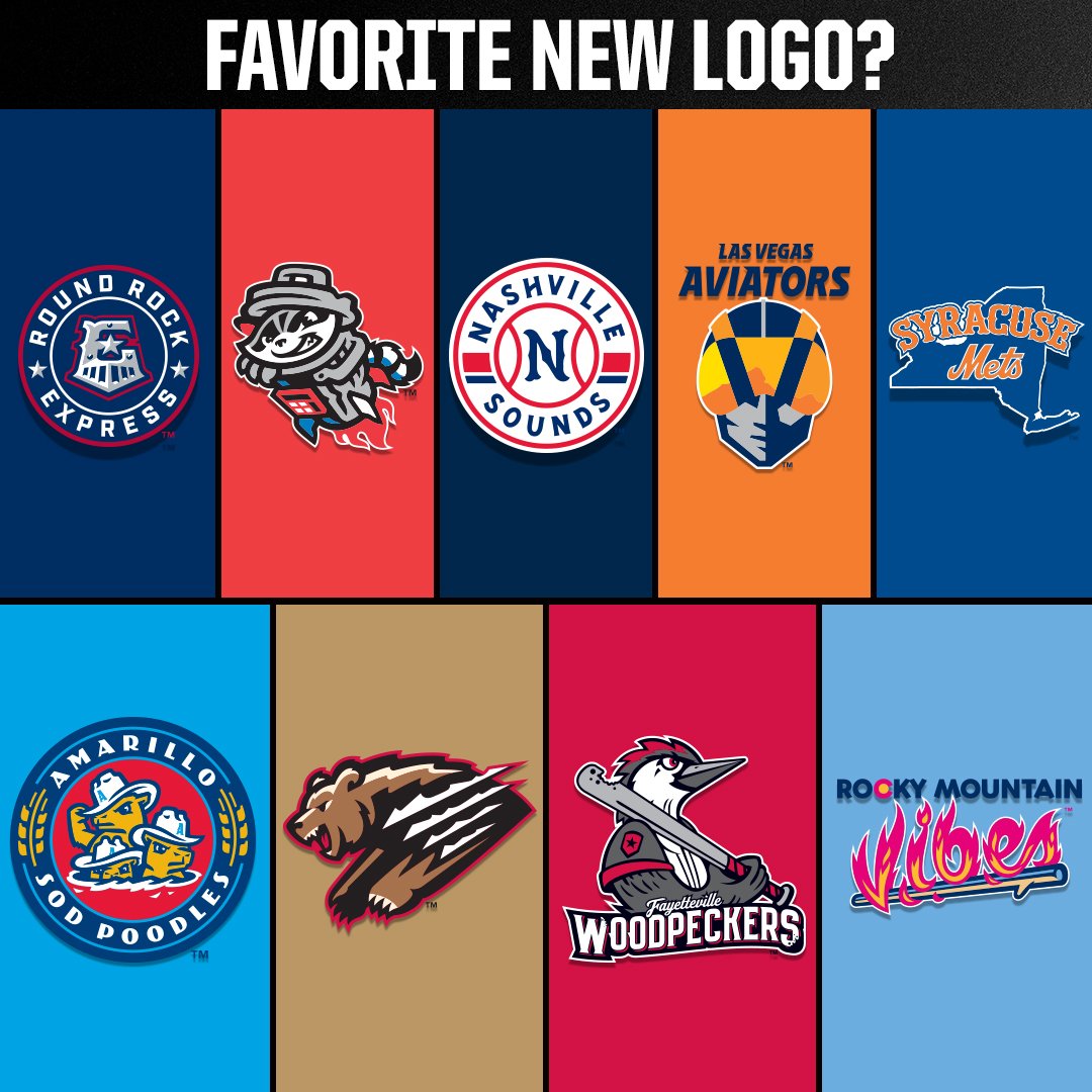
Minor League teams seize every opportunity to change their identity in name, look or both. Four of the nine teams, all AAA teams, changed their look/identity because of the change of affiliation. The least drastic change was the one of the Round Rock Express. The team changed affiliations as it left the Texas Rangers and joined that other Texas-based team, the Houston Astros. As a result, the Express’ logo got a modest change in which the Astros’ star was added. For the rest, the logo remained the same pretty much. At least that was for the cap logo. The main logo underwent a major change as it looks a bit like the logo of the parent club. A roundel with the cap logo in the center.
The former Syracuse Chiefs were acquired by the New York Mets, who did what they  always seem to do; name a farm team after themselves. As a result, the name Chiefs has disappeared into the history books and the International League now has another team that has been named after the parent club. The logo has the outline of the state of New York covered with the name Syracuse and Mets. Nothing special if you’d ask me.
 The third AAA team that changed its logo thanks to an affiliation change was the Nashville Sounds. As the Texas Rangers signed a PDC with the club, the Sounds also announced they would change their look. According to the club, the main logo would look more like the one of the parent club. Even though the logo is completely different than the previous one, I cannot discover a similarity with the Rangers’ logo other than the circular shape.
The fourth AAA team with a new logo is the Fresno Grizzlies. Even though it wasn’t  mentioned specifically, the logo change came after a change of affiliations as the Houston Astros turned their back on the team and were replaced by the Washington Nationals.
Even though there was nothing wrong with the previous logo, the new logo is an improvement for sure. The new main logo looks more fierce than the previous one and with the new logo come several new secondary logos and a completely new look for the team.
![]() A fifth AAA team with a new logo are the Las Vegas Aviators, previously known as the Las Vegas 51s. The new main logo shows a (fighter) pilot head wearing a helmet that reflects the hills/mountains of the Red Rock Canyon which is nearby Summerlin, the new home of the team. The Aviators used the move into a new ballpark as a reason to change the name and the look. Even though I did not like the new logo, I must admit that I am slowly getting used to it. With the move to a new stadium came another affiliation change as the Oakland Athletics relieved the New York Mets as the parent club.
A fifth AAA team with a new logo are the Las Vegas Aviators, previously known as the Las Vegas 51s. The new main logo shows a (fighter) pilot head wearing a helmet that reflects the hills/mountains of the Red Rock Canyon which is nearby Summerlin, the new home of the team. The Aviators used the move into a new ballpark as a reason to change the name and the look. Even though I did not like the new logo, I must admit that I am slowly getting used to it. With the move to a new stadium came another affiliation change as the Oakland Athletics relieved the New York Mets as the parent club.
So far for the AAA logo changes.
At AA there will be a completely new team at the Texas League as the San Antonio  Missions moved to Amarillo to become the Amarillo Sod Poodles. The name is following a trend of silly/crazy names many clubs have adopted in the past several years. The logo of the new club shows a bunch of prairie dogs wearing a stetson. With the new identity, comes a lot of secondary and alternate logos.
 Another new look at AA will be in the Southern League. Even though the Mobile BayBears yet have to play their final (2019) season, the new owners of the club decided to present the new name and look of the club that will replace the BayBears: the Rocket City TrashPandas. Like many other MiLB logos, the logo of the TrashPandas has been designed by Brandiose. But the new look is not typical Brandiose. Normally you can tell when a logo is designed by the San Diego based company but not in the case of the TrashPandas. The main logo of the club shows a panda sitting in a trash can that serves as a rocket.

From AA we go to A Advanced where the Buies Creek Astros will move into a new stadium in Fayetteville. So in need of a new identity, the club opted for the name Woodpeckers. The new logo is mainly grey with a touch of white, black and red.
 Then only one team remains. At Advanced Rookie season level, another move was in the making when the Helena Brewers left to fill the void that was left by the AAA Colorado Springs SkySox. The new Pioneer League team will be named Rocky Mountain Vibes. The primary logo features the team name “Vibes” in a fiery font resting on a marshmallow roasting stick.
Now, what is the best logo of the aforementioned nine? Of course, it will always be a matter of taste but IMHO, the new Fresno Grizzlies logo is the best by far, followed by the new logo of the Las Vegas Aviators. The Sod Poodles’ logo is a good third, followed by the new Express logo. To be honest I do not care much about the remaining five logos. The absolute worst new logo is the one of the Syracuse Mets. It lacks creativity and is far from original.