West Virginia Power rebrands
Yes. It is that time of the year again. Uuuhm. Not quite. Normally, rebrandings happen after the season but apparently, the Atlantic League doesn’t mind. As a result the West Virginia Power rebranded between the two games of a doubleheader against the Long Island Ducks.

Minor League Baseball, even before the money grab move of MLB, never would have allowed this to happen during the season. Anyhow, the West Virginia Power rebranded into Charleston (WV) Dirty Birds.
The name Dirty Birds can be derived from the mining industry of West Virginia. In the old days, miners took birds with them in a cage down into the mines. The purpose of this was to warn the miners for gasses. The birds would be the first to die from it.
The rebranding comes with new uniforms and caps. First of all, the jersey. The jersey is a white pull over with black sleeves. It sports the name Dirty Birds in playful orange letters with a black outline. On the left sleeve, the club logo is depicted. At the bottom of the sleeves there is a double thin powder blue piping. Also around the V-neck of the jersey, a powder blue piping can be seen. 
Personally, I am not fond of pull over jerseys but I like the design of this one anyway.
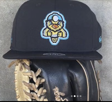
 Then the caps. The main cap is a black one, sporting a bird that wears a mining helmet. To make the logo a bit more tough, the bird is looking angry. Even though the name West Virginia was scratched from the team name, there is still a referral to the state. The little paws of the bird are shaped like a W and a V.
The team is sporting two more caps as well. First of all the road cap. This is a powder blue cap with a black lid. The crown sports a white C shaped symbol. At first sight it may not be clear what it actually looks like but when you take a closer look, it has the shape of a lamp that is attached at the front of a mining helmet. As far as I am concerned, this is the best cap of the three by far.  The team also sports an alternate cap. This cap also has a powder blue color but it has a white front, sporting the head of the main logo.
As far as yours truly is concerned, this rebranding is a great one. I never really was a fan of the West Virginia Power brand. This new look is refreshing and has a link with the history of the area.
The caps are made by the brand OC Sports and come in flex fit style.
