Danville Braves unveil new logos
A year before the club may be contracted, the Danville Braves unveiled a new main logo and new cap logos.
![]() Amidst the hullabaloo of MLB’s plan to contract 42 minor league clubs, the Atlanta Braves’ affiliate presented a couple of new logos. The new main logo is a roundel with the text Danville Baseball. In front of the roundel is the classic Braves script/logo.
Amidst the hullabaloo of MLB’s plan to contract 42 minor league clubs, the Atlanta Braves’ affiliate presented a couple of new logos. The new main logo is a roundel with the text Danville Baseball. In front of the roundel is the classic Braves script/logo.
Compared to the previous logo, the script/logo remains the same. But instead of the roundel, the background had the shape of a baseball diamond. 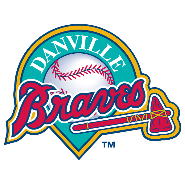
Next to the revamped main logo, the club changed the cap logos as well.
The D logo on the home cap has been changed significantly. The previous home cap sported a D accompanied by a tomahawk. The new home cap sports a single D in a different shape.

The alternate 1 cap sports  the same D but this one is more red than the one at the home cap and the logo contains an interlocking tomahawk.
The Braves will also sport an alternate 2 cap. This alternate cap sports the same logo as the  alternate 1 cap. The main difference between the two caps is the color of the lid. The alternate 1 cap has a red lid while the alternate 2 cap is all navy.