RiverCats present new alternate cap to celebrate 20th season
Founded in 2000, the Sacramento RiverCats will exist 20 years in 2019. To celebrate this milestone, the club has presented a new alternate cap with a logo that dates back to the original logo of 2000.
![]() The new hat has an element of the original 2000 logo. That logo showed a RiverCat stepping over a bridge and pushing a baseball into the water.
The new hat has an element of the original 2000 logo. That logo showed a RiverCat stepping over a bridge and pushing a baseball into the water.
The alternate cap log shows the paw, the ball and the splash of that very first logo.
The cap comes in black with a crimson lid. The pawn of the logo is grey and the splashing water is blue (of course).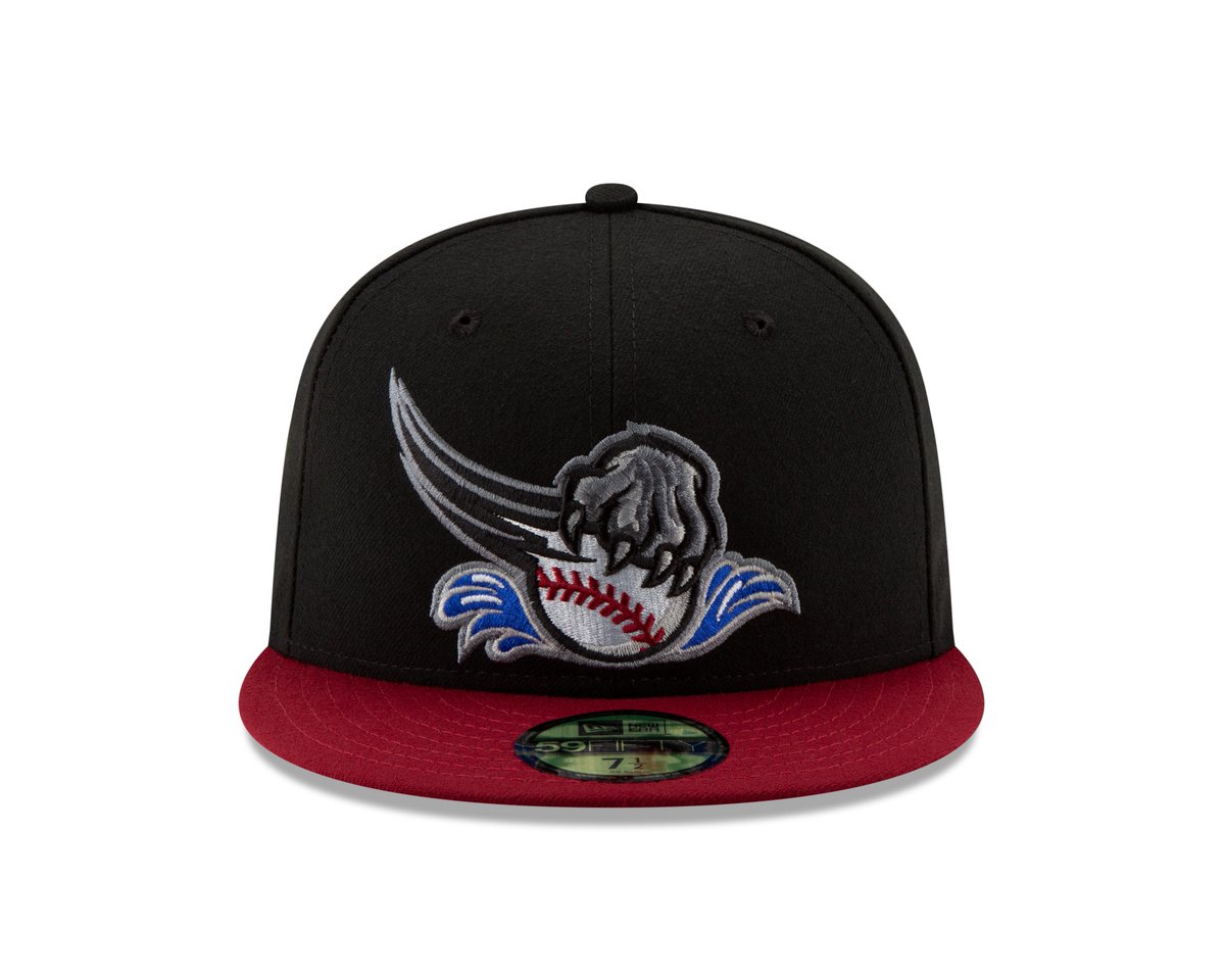
The crimson lid can be explained as that shade of red is one of the main colors of the ballclub. The word Rivercat in the current logo has that specific shade of red.
Luckily the RiverCats keep their own identity instead of adapting to the parent club, the San Francisco Giants in this case.
It is not clear if this cap will be worn for only the 2019 season or if it is a keeper.
The following Youtube clip shows the evolution of the various logos of the Pacific Coast League (AAA) franchise in a reverse order.
https://www.youtube.com/watch?v=o4vNRjHdkyc&feature=youtu.be
Personally, I like this hat. I think it looks better than the regular caps the RiverCats are sporting.