New look for Pawtucket Red Sox
The baseball off season is a time for teams to rebrand. I mentioned the rebranding of several Minor League clubs already (Oklahoma City, South Bend, Daytona, Biloxi and San Antonio). Yesterday another Minor League club unveiled a new look: The Pawtucket Red Sox, AAA affiliate of the Beantown ballclub.
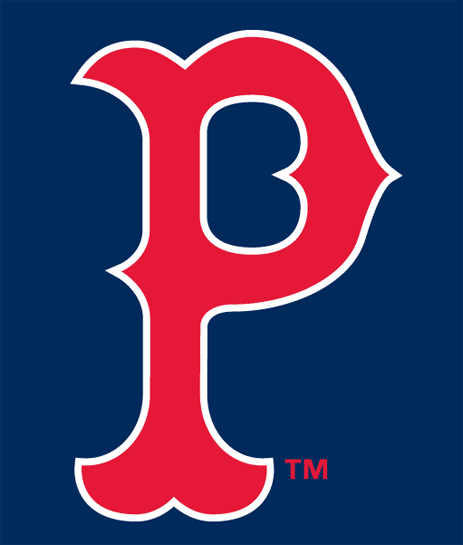
Here is a broad variety of logos, alternate logos and cap logos that the PawSox used in the last few years. Even though I am not a Red Sox fan (my Yankee fan’s religion doesn’t allow me), I always liked these logos.


![]()


But now the PawSox brass thought it was time to renew their look. Even though I don’t think this was necessary, the logos were good enough IMO, I can understand. Every Minor League club does that once in a while to generate money.
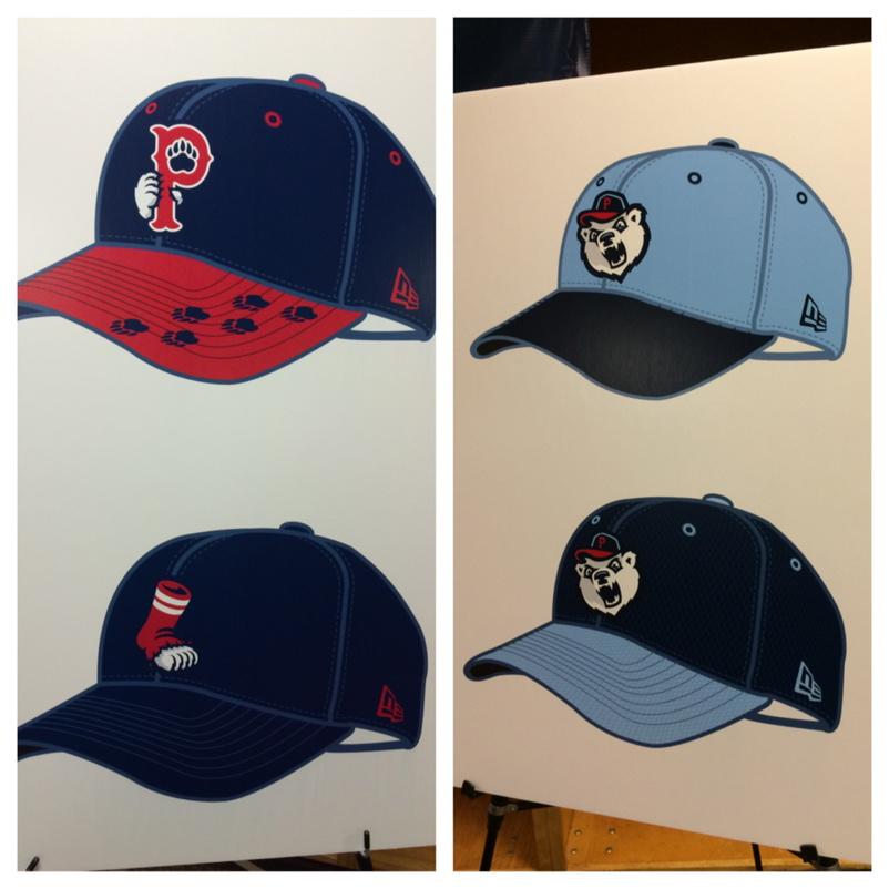
The new logos look like this

and this

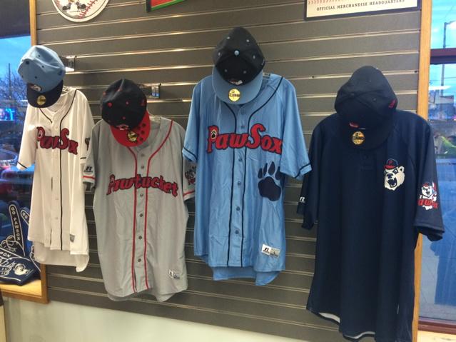
This is what the new jerseys look like.
There is one cap that has a nice twist; take a look at the top left cap shown below. It has some paw prints on the lid.
It is clear that the PawSox focus on children with this new look. Nothing wrong with that. It is what Minor League baseball is all about: children, families and weird promotions. That’s what I like about it.
The new look was designed (once again) by Brandiose. They also were responsible for the new looks of the Biloxi Shuckers and the San Antonio Missions. It looks like the club wants an own identity. The new look is emphasizing the paw instead of the sox even though the P on the cap still has the same look as the B on the Boston cap.
I am not overly excited about this new look, but I must admit that I have seen worse. And if this new look generates a lot of new money, I can only say that has been a good move by the PawSox brass.