Oklahoma City Dodgerized
As soon as the news was spread around that the owner group of the Dodgers had bought the Oklahoma City RedHawks, I had a hunch that the team (the RedHawks) would adopt the parent club’s identity somehow.
Until this off season, most Dodgers farm teams adapted their parent’s identity more or less. The Chattanooga Lookouts used to have red caps. After the Dodgers took over the caps turned to blue. The Rancho Cucamonga Quakes had one of the best jerseys in baseball: Sleeveless jerseys with black t-shirts underneath them. In the second season of the PDC with the Dodgers, the jerseys got sleeves and they looked more like Dodger jerseys. The teams started to sport Dodger blue alternate jerseys and caps as well. So did the Albuquerque Isotopes. The Ogden Raptors sport a Dodger blue alternative jersey too. The only team in the Dodgers’ farm system with (still) it’s own identity are the Great Lakes Loons.
I am very curious how long it will take before the Tulsa Drillers (replaced the Lookouts as the Dodgers AA team this off season) will start to wear Dodger blue.
The Dodgers are not the only teams who did this. The Braves have named almost all of their farm teams after themselves. The Cubs named their AAA team and A Full Season team after themselves. Their former A Advanced team in Daytona Beach was called the Daytona Cubs. The Red Sox were very original to name their AAA team in Pawtucket Red Sox too. So this move by the Dodgers isn’t something new.
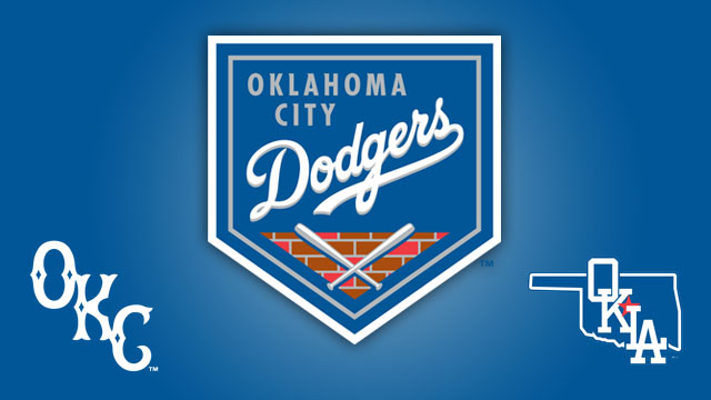
Have a look at the new logo and cap of the Oklahoma Dodgers.
Cap logo, primary logo and road cap logo.


This is what the new unis will look like:

The only thing that refers to the Bricktown area where the stadium is located is the logo on top of this post.
For the change, Brandiose didn’t design the new brand. The Dodgers did this themselves.
Director of the LA Dodgers Graphic Design, Ross Yoshida said the following about the new brand: “the Dodgers didn’t want to slap Oklahoma City over an existing Dodgers logo and call it a day. We wanted to tailor the Dodger brand to something that people in Oklahoma City could take pride in, hence elements like the homage to Bricktown on the primary logo and the SkyDance Bridge patch on the home uniform.”
He can name it whatever he wants, but I wonder what was wrong the the name RedHawks and the old logo. This rebrand thing is a bust. It is proof of poor taste, lack of inspiration and lack of freshness. In other words, the team is Dodgerized.
The same goes for the Braves and the Cubs: there is so much more to gain with a name that is linked to the area where a farm team is located. It will build a link with the community.
Just my two cents.