Springfield Cardinals Rebrand: Missed Opportunity
On August 26, 2026, the Springfield Cardinals announced a rebranding. Away with the old Cardinals moniker, in with something new. Yesterday, the team announced a new moniker and new logos in a brand launch party.
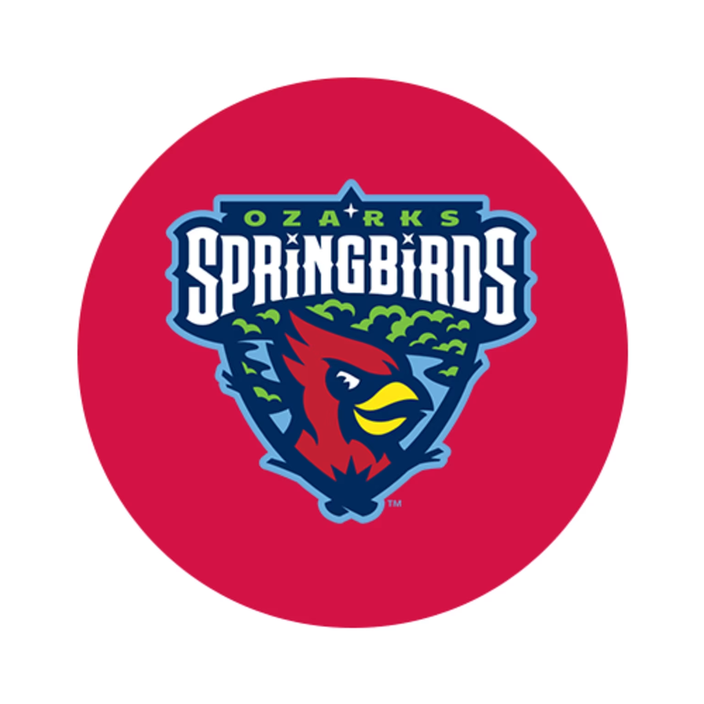
The new name of the Springfield Cardinals is Ozarks Spring Birds. Of course the name isn’t a referral to the parent club, which is a win but unfortunately, the logos are still a nod to the St. Louis Cardinals.
The Springfield based club should have looked to the Winston Salem Ridge Yaks. The Salem based club totally abandoned the Red Sox name and looks. Especially as the Springfield Cardinals announced with a lot of fanfare that the logos and the moniker would be something related to Springfield or the Ozarks.
First of all the name. The link to Ozarks is a good one. The name Spring Birds can refer to a broad variety of birds: Robins, Sparrows, Blackbirds, a.s.o. But what did the Ozark Spring Birds come up with as a logo? A cardinal. So still a link to the parent club. But very likely, the name Spring in Spring Birds will refer to Springfield for sure.
Don’t get me wrong, there is absolutely nothing wrong with the looks of the new caps and uniforms, I only think it is a shame that there still is a need of a link to the parent club even though it was announced that there would be a local link.
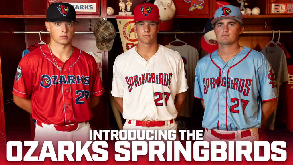
Also with the colors of the caps, there is a nod to the parent club: A red home cap and a navy road cap. Personally I like the victory blue cap with the red piping. And there is absolutely nothing wrong with the cap logos. They are fresh, crisp and absolutely good looking.
According to the Spring Birds’ website, the three stars in the main logo (see top) represent the city of Springfield: innovative spirit, connection with nature and Ozarks culture. A light blue background represents tranquil Ozarks waterways.
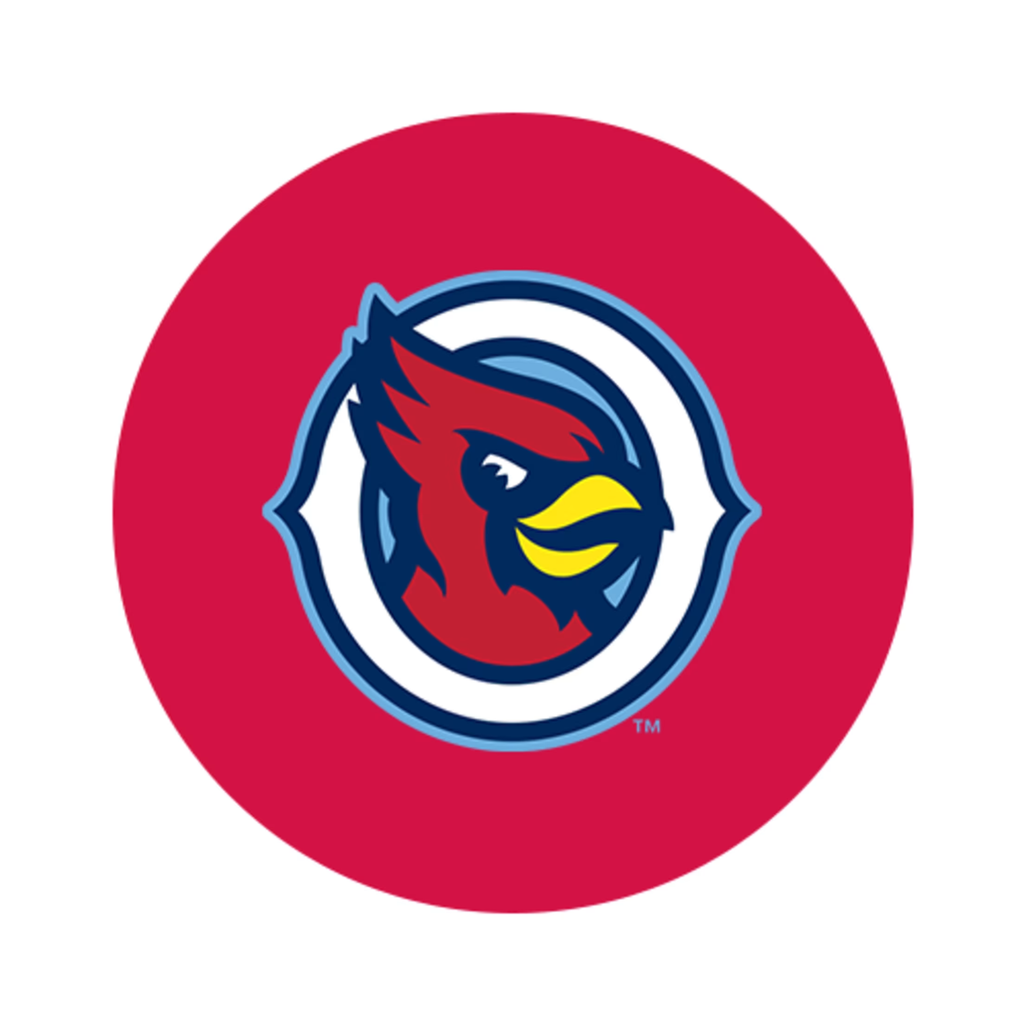
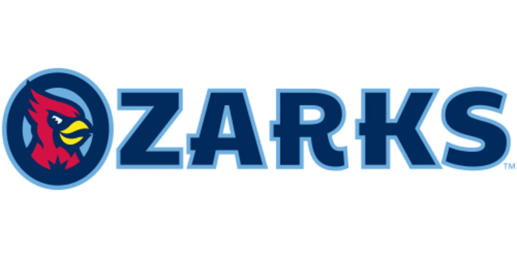
Then the O-Bird. According to the club’s website, it lives on our road/jersey and our batting practice hats. Here lies the same new Cardinals-inspired bird at the heart of it all, encompassed by our new “O” to represent our new geographical identifier. The franchise selected “Ozarks” to unify the fanbase, which supports this team from all over the region.
The S-Feather. The Spring Birds’ website states the following: An alternate logo that will be used in a variety of ways. Springfield is still at the heart of everything the club does, with Route 66 Stadium continuing to reside Downtown. With the adoption of the widely used unofficial (now official) nickname “Springbirds” as our new moniker, the S-Feather brings together Cardinals Nation and the city of Springfield in a simple and elegant way.
The Batbird. “This character is created to represent the attitude and energy of St. Louis’ top prospects that make their way through Springfield en route to The Show. A stronger and more confident avian friend, ready to take on the famed Texas League and carry the legacy of Cardinals Nation from Southwest Missouri to the world,” the website states.
A lot of red in this blog post. The next red-ish logo is the Hat Shield. It is a simplified logo of the main logo, suitable to fit on the home and road cap.
To finish this blog post, I will post the word marks and the caps that are available for purchase already.
The Ozarks SpringBirds wordmark comes close to the word mark of the home jersey, except for the word Ozarks, that is missing there.

To conclude, the new look is very nice. It is fresh, it is modern and it represents the area well. Also the new name hits the nail right on the head. But I think it is really disappointing that the logos, no matter how nice they are, show a link to the Cardinals, especially when the club announced there would be a link to the Ozarks/Springfield.
To end on a positive note, the new look is absolutely better than the one it is replacing.