Greensboro Grasshoppers Launch New Look
It is that time of the year again. Minor League teams coming up with new names and new looks. This time it is the turn of the Greensboro Grasshoppers, the High-A farm team of the Pittsburgh Pirates.
Last night, the club unveiled a new and fresh look. New uniforms and new logos.
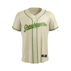
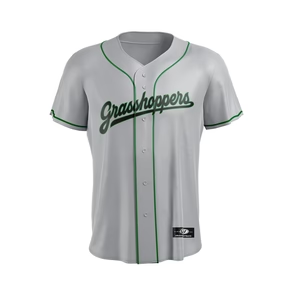
The look remains green, but instead of hunter green, the team opted for Kelly green.
Compared to the previous logo(s), the new ones are more simplified, which isn’t a bad thing necessarily.
You can compare the old and new logos below:
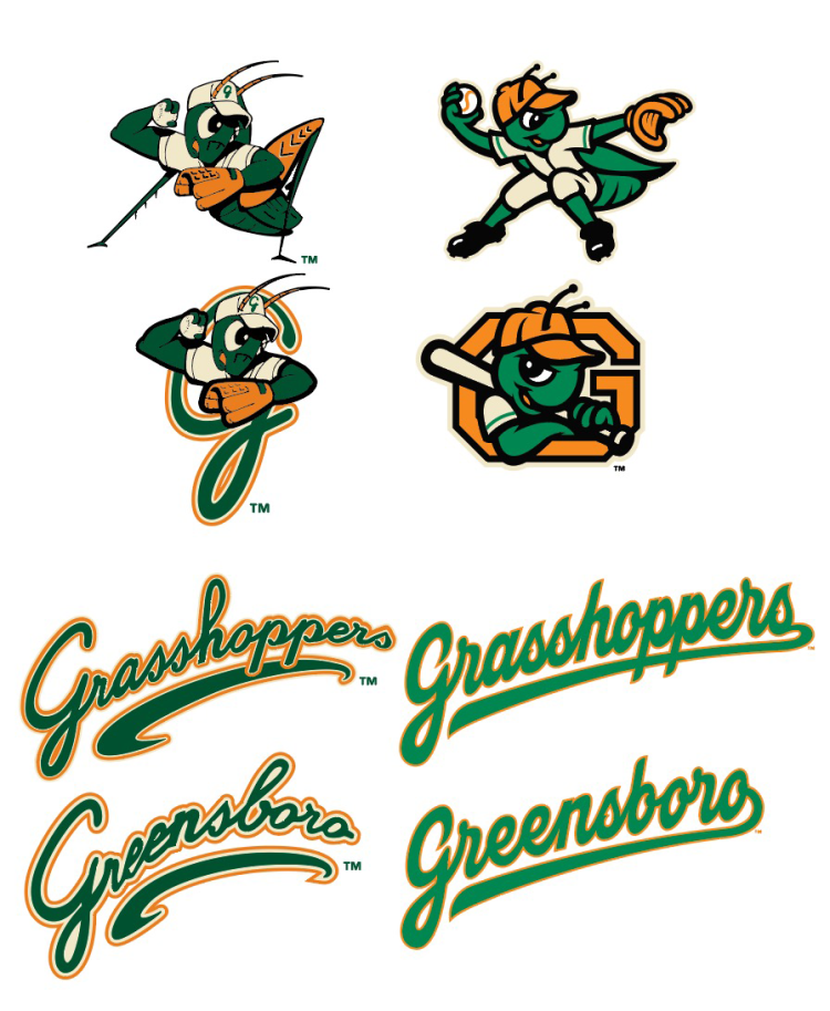
When it comes to the script, I think the old version was better with the orange outline.
The new logo looks good. As written above, more simplified. The playful G of the old logo has been replaced by a block G.
Nowadays, it is common to come up with some alternate cap logos. The Grasshoppers do not disappoint when it comes to that. An orange alternate cap, meanwhile, depicts the Grasshopper throwing a baseball. This mark is reminiscent of the team’s previous fielding-centric primary logo (a hopping grasshopper catching a ball on the hop). A second alternate cap logo, described as the “blade of grass G,” features green swirls against a black background.

The change of their looks is all part of a twentieth anniversary celebration. GM Tim Vangel stated: “We’re switching up the uniforms a little. Going with a gray road pant and a gray and black jersey top. Then we’ll have the Kelly green and cream for the home. So hopefully it’ll go over well.” The regular home and road jerseys are “button down” while the two alternates are merely softball style jerseys.


Unfortunately, the uniforms were not properly shown during the presentation, so the DBH cannot show a complete look including caps. So far, the on-field caps are nto available in the web shop, so you cannot have a look at them.