Kansas City Monarchs New Uniforms Very Disappointing
When the Kansas City T-Bones came out with the news they had adopted the name of the Kansas City Monarchs to honor the famed Negro League team from the past, yours truly was looking forward to the new uniforms. Today the club presented its new look and what a bummer it is.
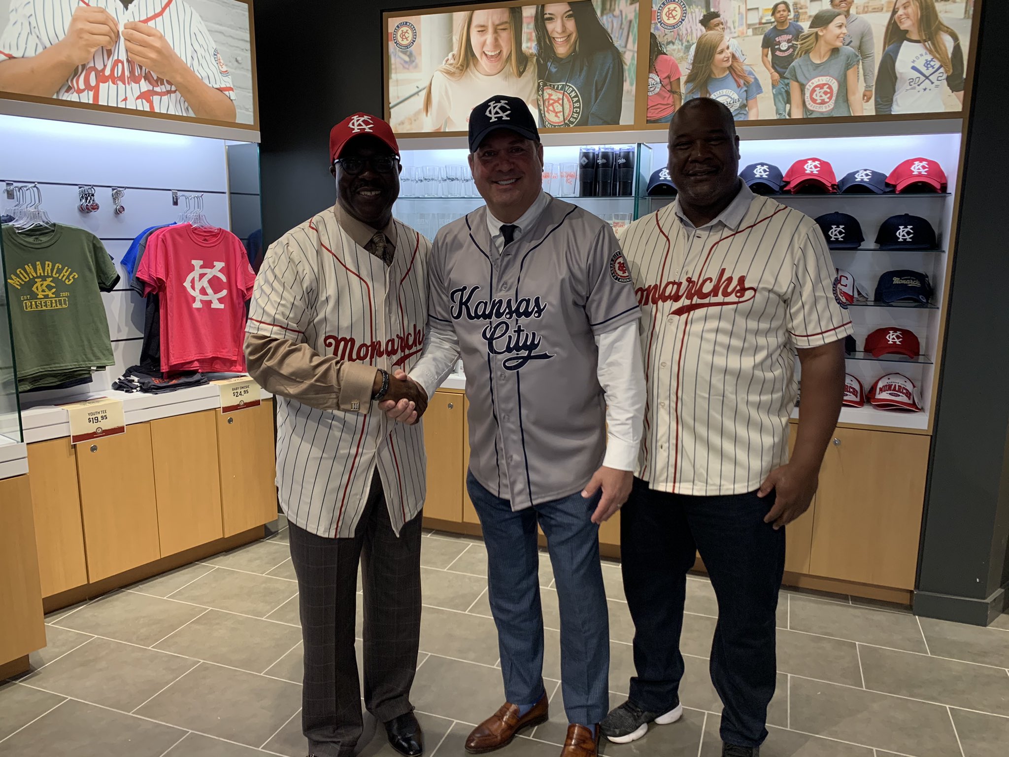
In the presence of Negro Leagues Baseball Museum president Bob Kendrick, the new uniforms were presented.
Even though I like the caps, the jerseys are not what I expected. The home jersey has a cream shade with red pinstripes and a red piping around the sleeves and along the button holes. I like the cream color of the jersey though. But the lettering is not really daring if you’d ask me. The name Monarchs is rather modest and it does not pop from the jersey. On the left sleeve a modern day Monarchs logo is attached.
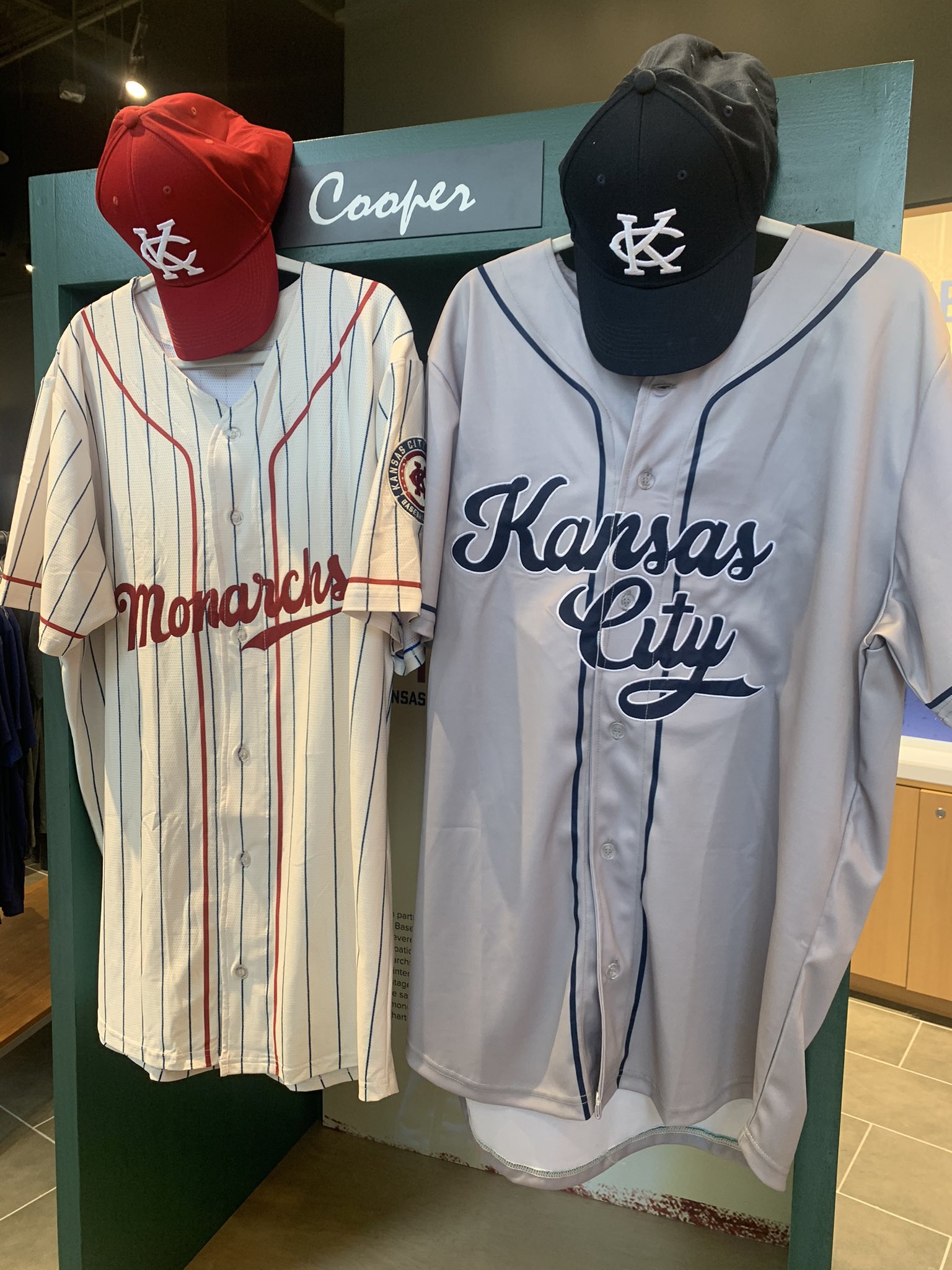
When it comes to the road jersey, I cannot say much as they are dull in general. This one is also gray and it sports the name of the city in two layers accompanied by a blue piping that is running up and down along the button holes. Also the bottom of the sleeves is adorned with the same blue piping. The same logo that is on the home jersey, adorns the left sleeve of the road jersey as well.
The caps are nice. They come close to that classic layout the Kansas City A’s once had. I can see myself by the homecap for sure.
Like I said, I was rather disappointed by the new look. I would have loved the big KC on the front of the jerseys and the caps, like the real Kansas City Monarchs did in 1942 (caps) and 1945 (jerseys). But perhaps the modern Monarchs were not allowed to used that look. As you know, the name Monarchs was chosen after a cooperation with the Negro Leagues Baseball Museum in Kansas City.
Perhaps it is a look that I need to get accustomed to. Who knows that I will like it in a few weeks or months. But for now I am not sold.
And perhaps I should look at it as an homage to the old days, in which the uniforms were not flashy at all. When that is the case, the designers did a good job.